Table of Contents
How do RowShare charts work?
To visualize your data, nothing beats a chart. We've worked hard to make creating a RowShare chart as easy as possible. Get insights into your data in a few clicks. Create a new chart. To add a chart…

Updated
by Antoine Driard
To visualize your data, nothing beats a chart. We've worked hard to make creating a RowShare chart as easy as possible. Get insights into your data in a few clicks.
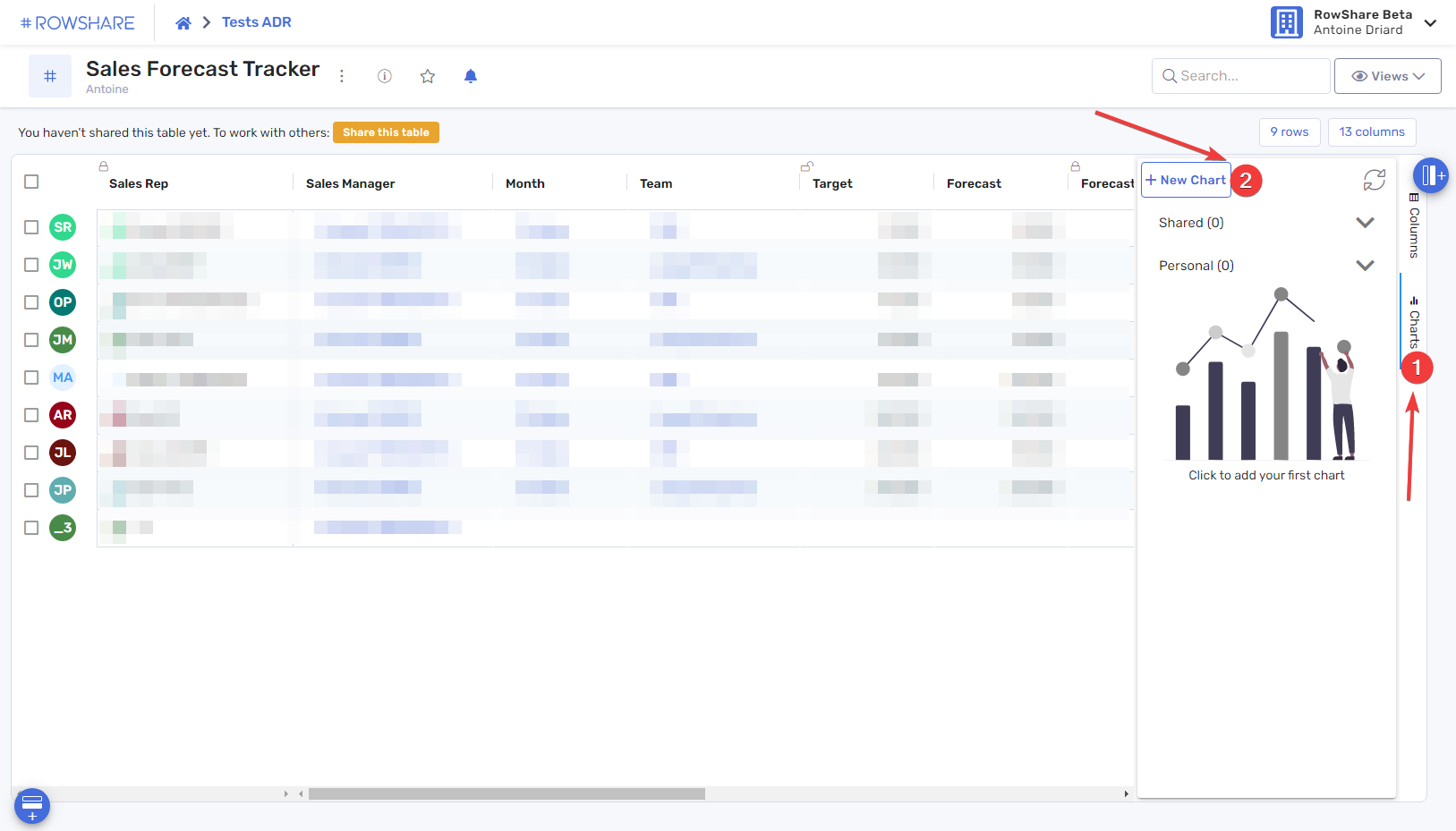
Create a new chart
To add a chart to a table, click Charts to the far right of the table, then click the New Chart button.
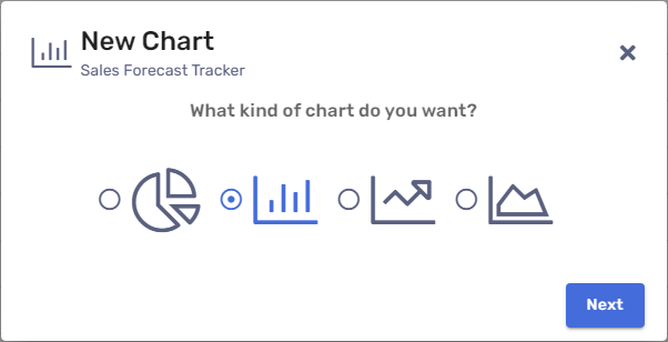
A wizard will guide you, in a natural and intuitive language, to decide what you want to see in your chart:
- Choose the type of chart you want to display:
- Next, you need to choose the data that will be reflected in your chart. Do you want to count rows? (as in "Number of Opportunities") or display the Sum of values in a given column? (as in "Total amount of opportunities")
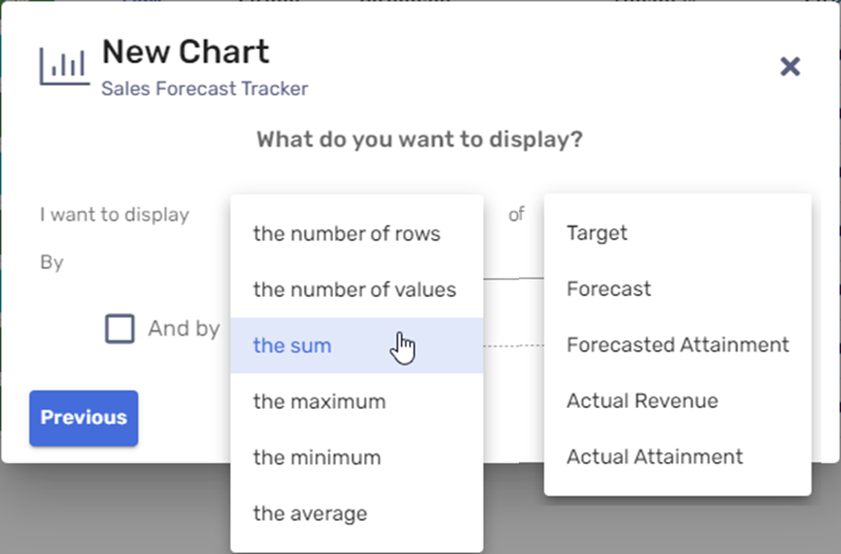
- How do you want to group your data? Do you want to count the number of rows, or the total orders per customer? project? case? product?
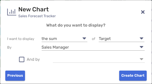
- Optionally, for some types of charts, you can specify an additional dimension if you want to display your information according to two criteria. For example: revenue per sales manager and per salesperson.
For bar charts, if you choose two dimensions, you can choose whether you want the information side by side (clustered) or one above the other (stacked).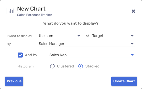
- Here is your first chart!
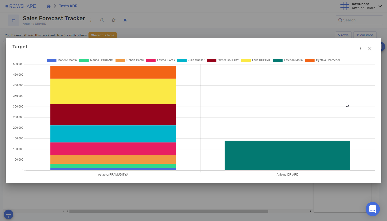
- If you close it, it will remain visible on the right side of your table.
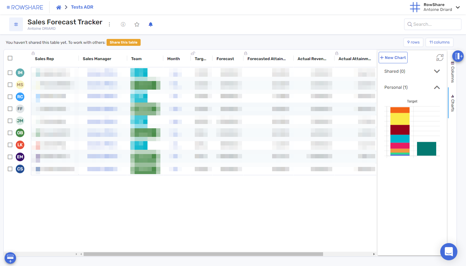
Additional options
Once your chart is created, you can share it, modify it, download it and of course delete it.
For all these actions, click on the chart thumbnail to display it in full screen, then on the menu at the top right:
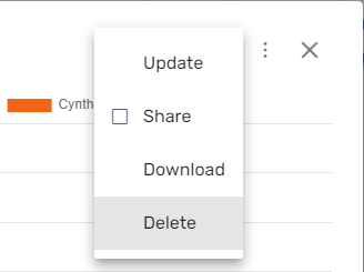
If you share a chart, it will appear in the "Shared" section in the right pane of the table. All other users of the table will have access to it, but everyone will only see the data of the rows to which they have access.
Only table admins can share a chart.
How did we do?
How can you visualize your data in RowShare?
How to analyze your RowShare data?